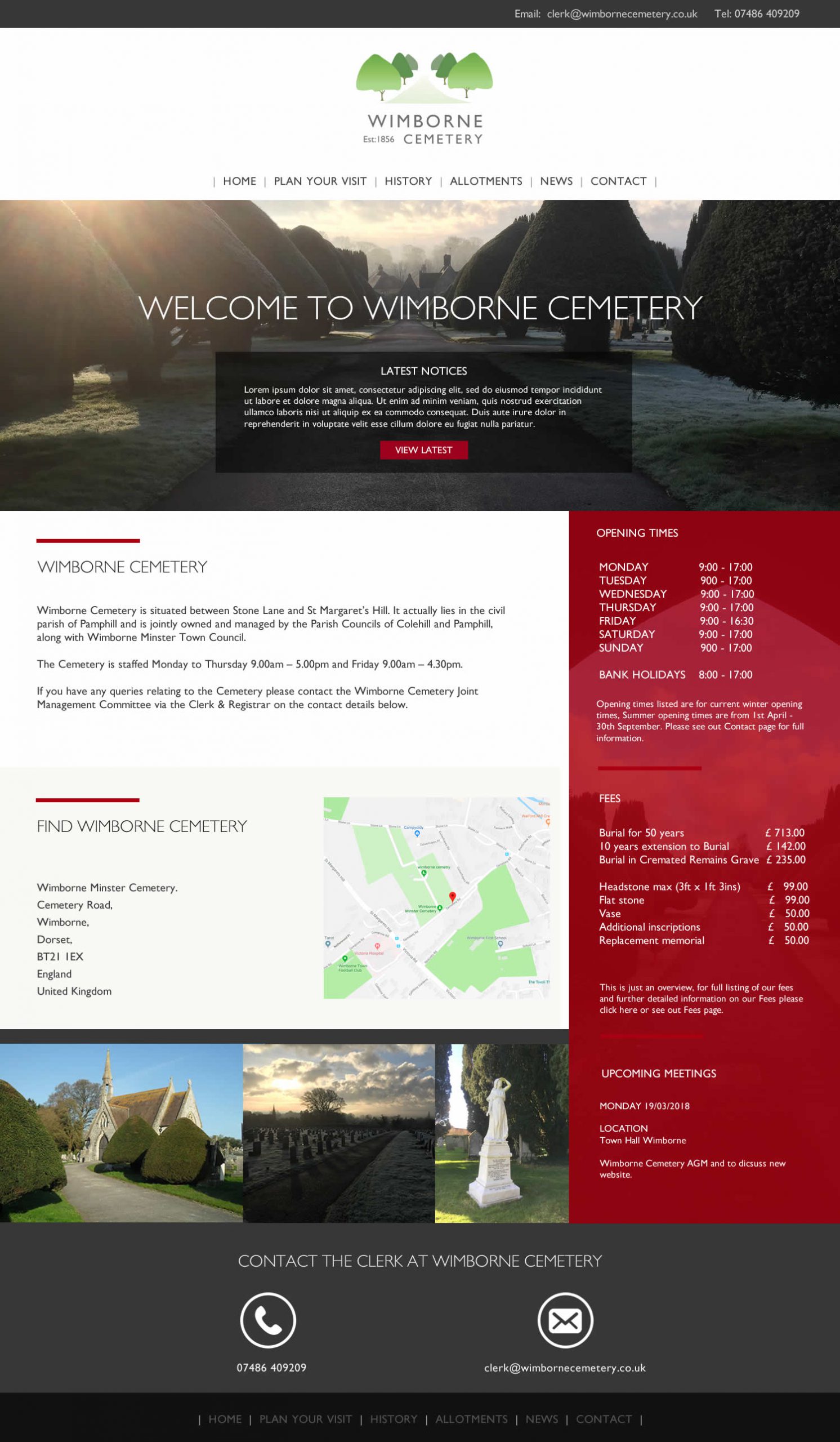
Wimborne Cemetery needed a new website to show their fees, opening times, history and various other areas of information that needed to be easily accessible to the general public. A new logo design was also discussed and approved. The website was requested to be easy to navigate, to look business like and professional and Karen also requested a deep red be used in the design. This is the final layout design that was presented to and approved by Karen the clerk at Wimborne Cemetery.
Wimborne Cemetery

Website and Logo Design
Project Specification Details
Website layout design, Graphic design, Responsive website
